Authors: Ashley Karr
Posted: Tue, April 29, 2014 - 1:18:59
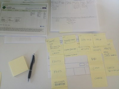
Take away:Wireframing is the phase of the design process where thoughts become tangible. A wireframe is a visual 2D model of a 3D object. Within website design, it is a basic, visual guide representing the layout or skeletal framework of a web interface. Page schematic or screen blueprint are frequently used synonyms.

When user experience (UX) professionals create wireframes, they arrange user interface elements to best accomplish a particular, predetermined task or purpose. They focus on function, behavior, content priority, and placement, page layout, and navigational systems. They lack graphics and a fancy look and feel. Wireframing is an effective rapid prototyping technique in part because it saves huge amounts of time and money. It allows designers to measure a design concept's practicality and efficacy without a large investment of these two very important resources. It combines high-level structural work, such as flow charts, site maps, and screen design, and connects the underlying conceptual structure (the information architecture) to the design's surface (the user interface). Designers use wireframes for mobile sites, computer applications, and other screen-based products that involve human-computer interaction (HCI).
The following are a few best practices for wireframing in the digital space:
- Be a planner. Gather information before you start jumping into wireframes. Make sure you, your team, and your clients are clear on the design's missions, goals, objectives, and functions. Make sure you are also just as clear on your stakeholders and users. (Did you remember that maintenance workers are design users, as well? No? Better drop the wireframe and spend a bit more time thinking...)
- Be a philosopher. Wireframing is "...like a finger pointing away to the moon. Don't concentrate on the finger or you will miss all that heavenly glory." Yes, I just quoted Bruce Lee in Enter the Dragon. How does this apply to wireframing? I will tell you. People tend to get hung up on the medium and not the quality and appropriateness of the wireframe. Wireframing programs are a dime a dozen. In my real-life, actual UX experience, I have discovered that people LOVE paper wireframes. They get excited when they are finally allowed to unplug their fingers from the keyboard, peel their eyes away from the screen, and do batteries-not-included usability tests outside in a courtyard chalk-full of pigeons, fountains, babies in strollers, and dogs playing catch with their owners.
- Be a child. So many people are afraid of being wrong or seemingly silly in a professional environment that they paralyze their creativity. If you are one of those people who worry so much about what others may think of you during a brainstorming session, go hang out with pre-schoolers for a morning. Dump a big pile of Crayolas on a table, fling around some colored construction paper, and notice what happens.
Wireframing is neither new nor innovative. Humans have wireframed for millennia—sketching out inspirations for new inventions, drafting designs for buildings and civil engineering projects, and developing schematics for massive travel and communication networks. Arguably, our first medium was the cave wall and lump of charcoal leftover from the previous night's fire. As human technology evolved from these prehistoric wares to papyrus to paper to computerized 3D-modeling programs and interactive systems, such as Balsamiq, Axure, and InDesign, what and how we wireframe has evolved in step. However, why we wireframe and wireframing best practices are timeless. In order to develop a viable final product, be it the Parthenon or a mobile phone app to track blood sugar levels for diabetics, humans have depended upon wireframes to organize and synchronize the design team's efforts and test early iterations to avoid disaster and make a good faith attempt at success.
Posted in: on Tue, April 29, 2014 - 1:18:59
Ashley Karr
View All Ashley Karr's Posts


Post Comment
No Comments Found