Authors: Miriam Sturdee
Posted: Tue, August 14, 2018 - 10:36:38
This blog post was co-authored by:
Miriam Sturdee, postdoctoral fellow in sketching and visualization, University of Calgary, [email protected]
Makayla Lewis, research fellow, Brunel University London, [email protected]
Nicolai Marquardt, senior lecturer in physical computing, University College London, [email protected]
If you’ve been to an HCI conference, workshop, or event recently, chances are you may have seen people sketchnoting—either as part of the main conference organization in the form of visual facilitation, or simply as part of personal practice.
Some of you may be wondering: What is a sketchnote? When we take notes, we are saving interesting points and ideas from a talk, panel, workshop, experiment, or participant to return to later. When we take SKETCHnotes, we are adding sketched visual elements to those points and ideas, whether it is as simple as emphasizing text, or adding icons and thematic references to the item being recorded (see Figure 1). Anyone can sketchnote; you don’t have to be an artist, illustrator, or even be able to draw—the important part is the ideas and thoughts you capture and developing the style that works best for you.
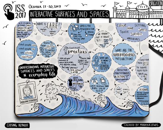
Figure 1. Sketchnote summarizing the closing keynote by Geraldine Fitzpatrick at ACM ISS 2017 by Makayla Lewis.
Sketchnote practitioners often believe recording information in a visual manner helps encode data for better recall, and the act of recording helps them to concentrate on complex topics or within often lengthy knowledge-sharing or idea-generation sessions. There is also joy in sharing these sketchnotes after a conference, workshop, or event (even with friends—sketchnoting goes beyond simply recording talks) to promote or reach out to the speaker, attendees, and non-attendees, or simply to share them as part of your personal or professional practice. The sketchnote has a life after a conference, workshop, or event, unlike the vague scribbles we may all be familiar with that languish at the back of a little-used notebook in our desk drawer. Spending time on your notes means you are more likely to return to them for reference, simply to reflect, or to use them as a visual prompt to support discussion with others.
With this new series of blog articles for Interactions, we will share many examples of sketchnotes from CHI and other related events and conferences, but also reflect on the practice of sketchnoting and share techniques of how to integrate sketchnoting as an everyday practice.
On Discovering Sketchnoting
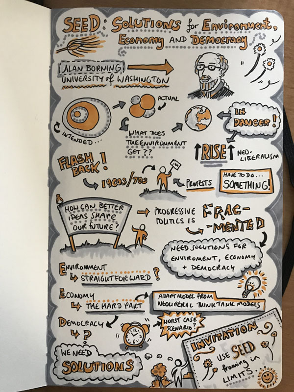
Figure 2. Alan Borning at ACM Limits 2018 by Miriam Sturdee.
Miriam: During my M.Res. year I was introduced to the sketchnote by a management science lecturer who was interested in alternative formats of recording and disseminating information. Eager to try out this visual form or notetaking, I read up about sketchnotes, took two pens, and attempted the practice at the next research talk I attended. It was of varied success: The Sharpie I was using was too fat in the nib and the ink bled through the cheap cartridge paper I had dug up from my art box. The resulting images were chunky, and somehow in my haste I had chosen a brown color to contrast my line drawings. Nevertheless, I had two pages of passable notes and I still remember the talk by Emmanuel Tskleves. For my second attempt, I used a sketchbook with thicker pages and a lighter-green color to contrast the imagery, but also tried to record every element of that talk (by Chris Speed)—the imagery was rushed, the words almost unreadable. I am happy to report, however, that I got steadily better, not least in part due to my acquaintance with, and constant encouragement from, Makayla Lewis, my now long-time collaborator. I share my sketchnotes on my Twitter account @asmirry.

Figure 3. Sketchnote of the workshop on the Future of Computing & Food by Makyala Lewis.
Makayla: Recently, I was interviewed by the Adobe Blog on “The Power of Sketchnoting in UX Design,” where I talked about how I use sketchnotes to brainstorm ideas, explore and understand new concepts, share user scenarios with colleagues, draw interviews to ensure a shared viewpoint with users, visualize interactions, and design futures to aid discussions and co-creation to help users clearly and simply express and share their experiences. Since 2012, I have put pen to paper—well, to be specific, a UniPin 4.0 black pen and Copic marker (a pastel shade and C3 grey) to a Moleskine sketchbook large, and sometimes a Surface Pen to Microsoft Surface— when at events, conferences, interviews, workshops, and at my desk. As an HCI researcher with an interest in user experience, human-factors of cyber security, and accessibility, I have created a back catalog of 500+ sketchnotes, of which 343 can be viewed publicly. Low-fidelity sketches often help to express experiences and complex content. They allow HCI researchers to better communicate and express their ideas, and share designs with colleagues, users, and stakeholders. Sketchnotes can enhance these sketches; the inclusion of simple connectors, containers, and separators with consideration of structure and style can better support the thinking process and communication of these thoughts to others. Thus, I think awareness and competency in sketchnoting for HCI researchers could be beneficial. I enjoy sharing my sketchnotes and process on my Twitter @maccymacx.
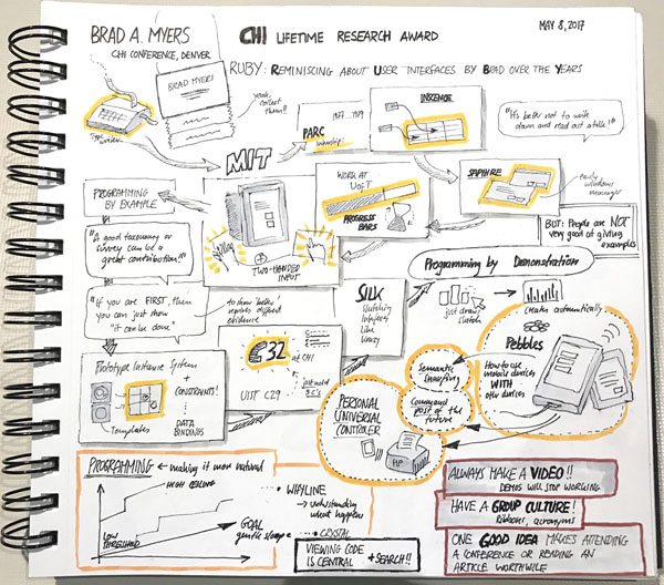
Figure 4. Sketchnote of Brad A. Myers Lifetime Achievement Award presentation at CHI ’17 by Nicolai Marquardt.
Nicolai: I started using sketching during my M.Sc. and Ph.D. studies and very quickly found that sketched ideas and concepts can very effectively support my research and design process in HCI. Later, while studying for my Ph.D. in Calgary, I joined as co-author to create the Sketching User Experiences Workbook (together with Saul Greenberg, Sheelagh Carpendale, and Bill Buxton), which summarizes many of the possible methods of using sketching techniques in HCI. During that time, I also began reading about using sketches for visual notetaking and came across Mike Rohde’s blog and books (see links below). I began creating visual notes of talks I went to, meetings I attended, and many other events I joined. An example from last year is my visual summary of Brad Myers’ inspiring Lifetime Achievement Award talk at CHI ’17 (Figure 4). For me, the sketched notes help me staying active and engaged during talks and make it easier for me to synthesize what is most important and how aspects of the presented work relate to research I’m working on. Many of my sketchnotes are shared on my Twitter account @nicmarquardt.
Sketchnote Tips and Tricks
To help anyone who is interested in taking up sketchnoting, and perhaps broaden their horizons in drawn imagery in general, we have put together some advice so that you can avoid the pitfalls some of us encountered along the way. Remember, the sketchnote mantra is IDEAS NOT ART— nobody expects a beautiful drawing as an outcome. Instead, it is important to keep practicing creating visual notes; you will see progress and find a style that works for you.
Choose your tools wisely. We’ll return to tools in a later blog, but for now, find a good pen that flows well and is consistent, and some paper or a sketchbook. It may also help to find a stiff board (or other material) to lean on. You can also work straight into your tablet or touchscreen laptop, but it might be best to start with simple pen and paper.
About the use of colors. For now, why not start with black and one pastel or light color to emphasize important points and a grey marker for shading.
Practice icons you think you will use regularly. For example, if you study smartwatches, a watch icon that you can draw quickly and in different orientations will be invaluable. Likewise, generic terms such as “AI” might be represented by a robot head, a computer with a face, etc.
Arrive early (if you can). It will give you time to find a good seat, preferably near the front. When at the front, you can draw a quick portrait sketch of the speaker(s), read all the slides without squinting, and are less likely to be disturbed by people coming and going. While you wait for the talk to begin, check the talk title, prepare your page, and get all your pens in order.
Don’t try to capture everything. Instead, try to capture the salient points, interesting quotes, and other items that jump out. You’ll be surprised by the depth of your sketchnote.
Use the Q&A time to verify and finish up. Fill in the gaps (if you are unsure about something, ask the speaker a question), complete areas you may have missed, and color or shade your sketchnote. You may not have time to come back to your notes for a while, so it is better to complete them during the session. Let’s be honest, sketchnotes are ultimately notes—how often do you return to complete your notes?
There are some great sketchnote resources on the web, here are some for a start:
Marquardt, Nicolai, and Saul Greenberg. "Sketchnotes for Visual Thinking in HCI" Workshop paper at ACM CHI ’12 Workshop on Visual Thinking and Digital Imagery.
The Sketchnote Handbook by Mike Rohde
The Sketchnote Workbook by Mike Rohde
Sketchnote Hangout by Makayla Lewis
Visual Notetaking for Educators by Sylvia Duckworth
19 Sketchnote Style Sheets by Makayla Lewis
100 + 1 Drawing Ideas: 100 + 1 Drawing Ideas for Sketchnoters and Doodlers by Mauro Toselli
Visual Thinking: Empowering People & Organizations through Visual Collaboration by Willemien Brand
365 Sketchnote Challenge by Makayla Lewis and Nidhi Narula
Posted in: on Tue, August 14, 2018 - 10:36:38
Miriam Sturdee
View All Miriam Sturdee's Posts




Post Comment
No Comments Found